/
WHOSDOOLEY
CONSTANTLY EVOLVING ✨
COTTON USA REBRAND
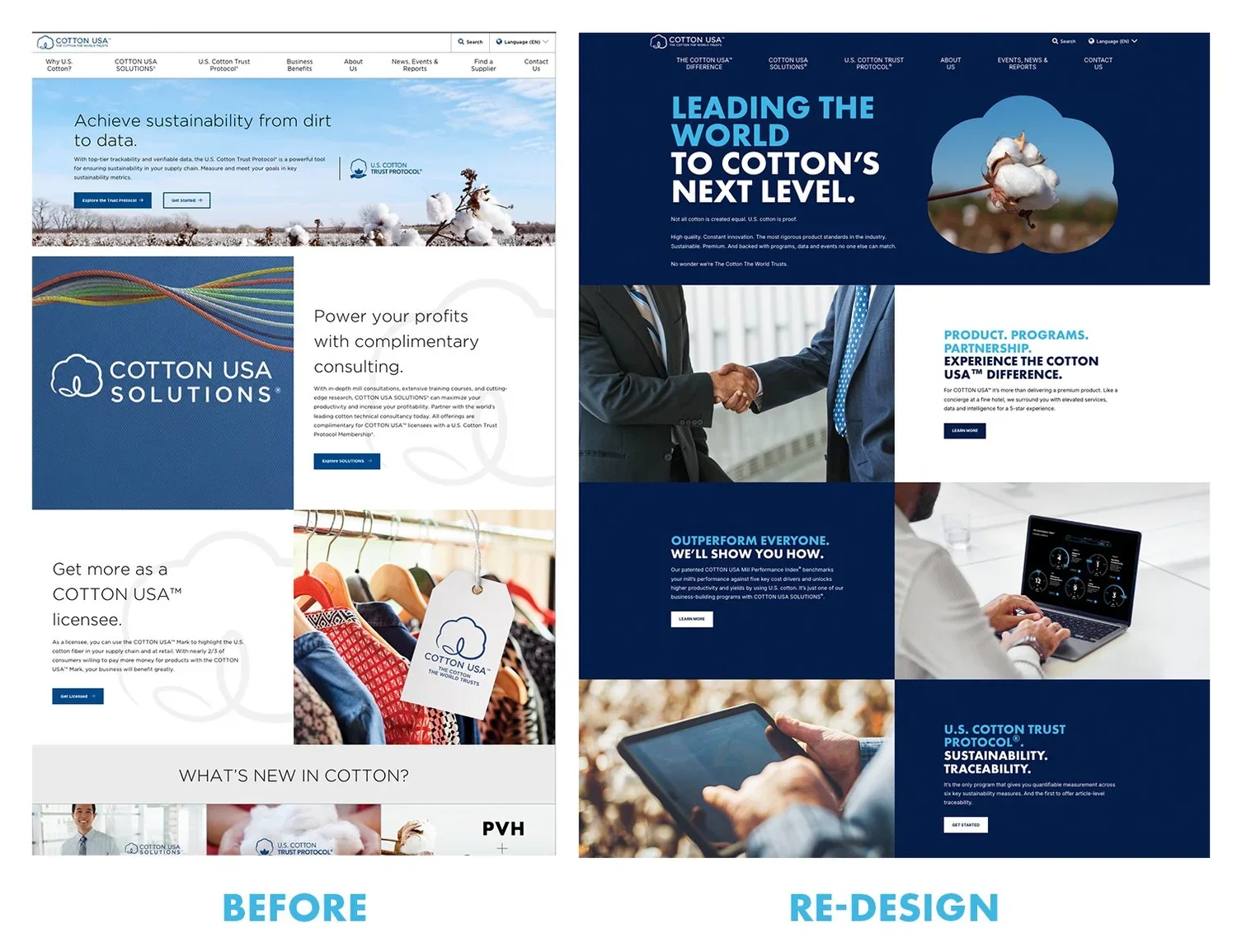
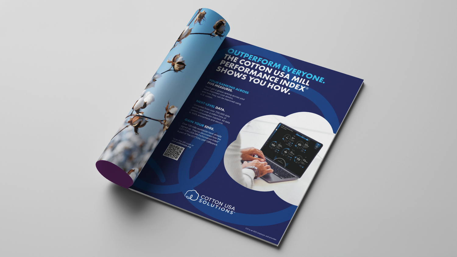
Cotton USA’s visual identity had become diluted as competitors began adopting their look. The challenge was to reestablish distinction without losing existing brand equity.
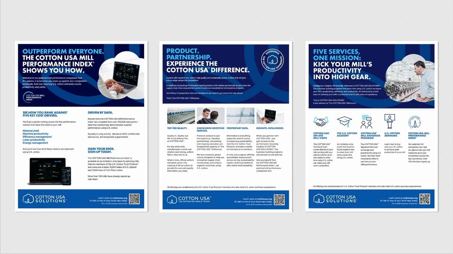
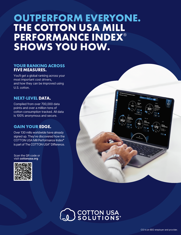
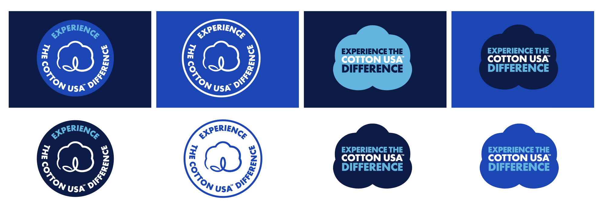
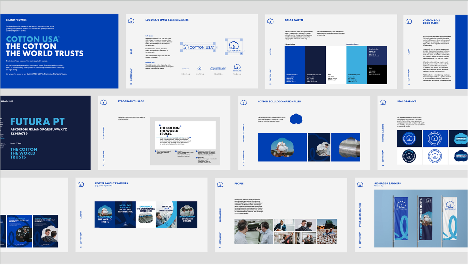
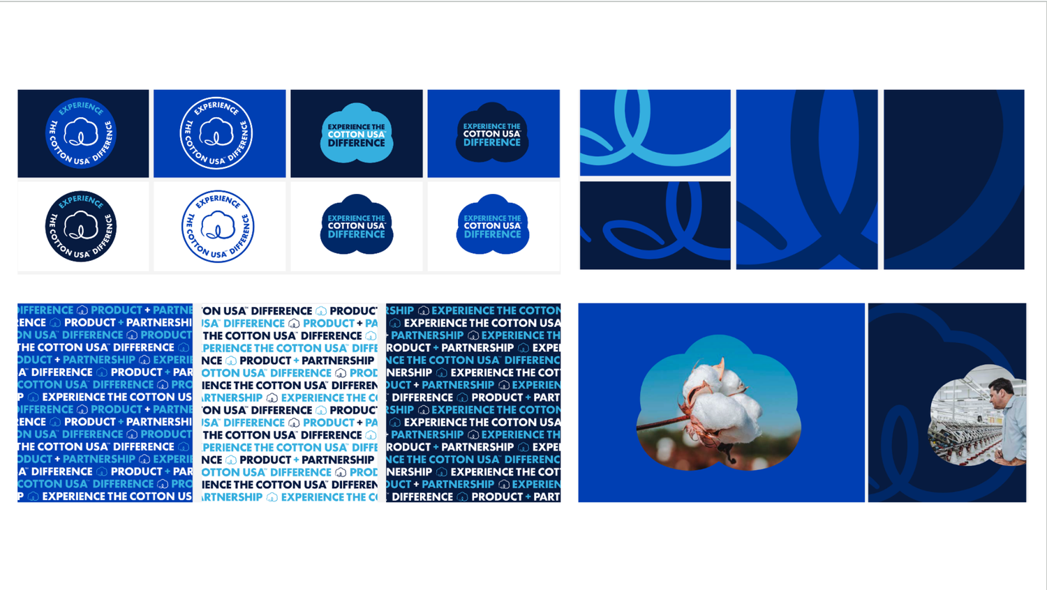
My team & I’s approach focused on amplification over complete overhaul & reinvention—pushing the brand toward a bolder, more confident visual language. Typography became a primary asset, driving hierarchy, tone, and recognition. We developed a flexible design system built on strong type, clear structure, and scalable graphic elements, allowing for consistency across a range of applications.
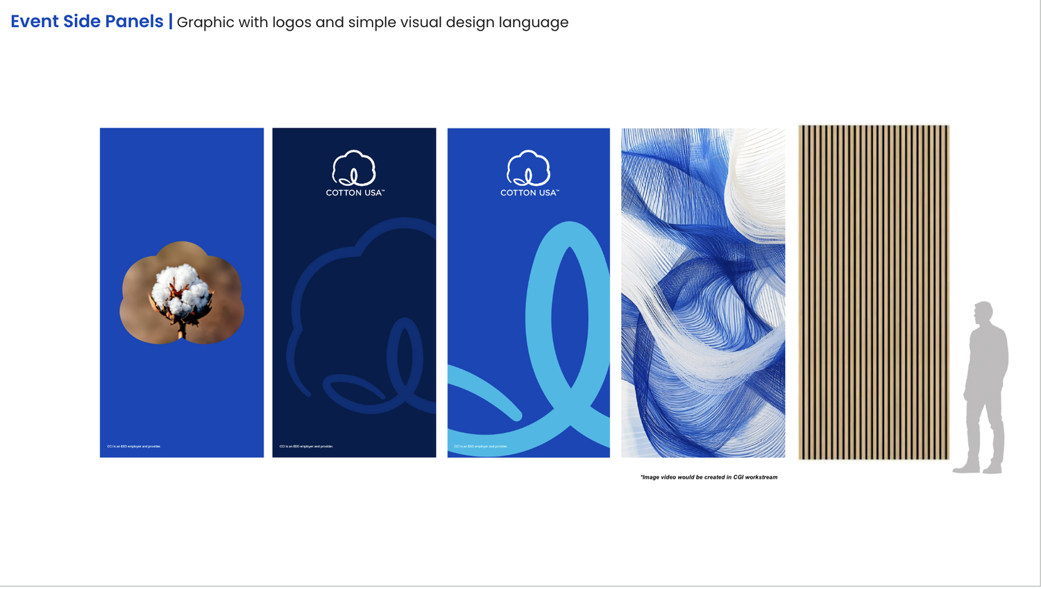
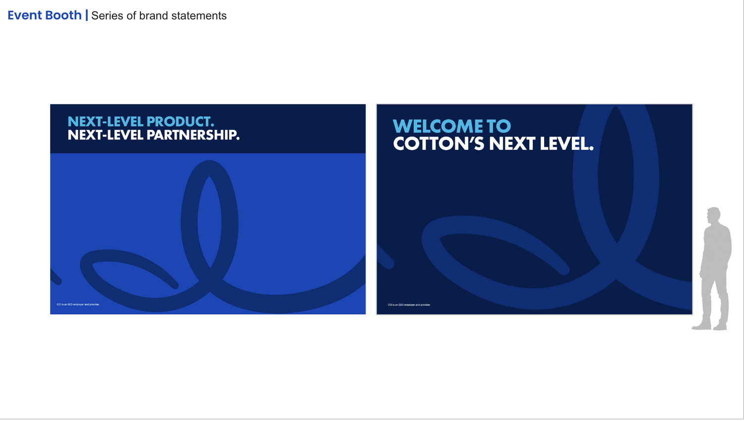
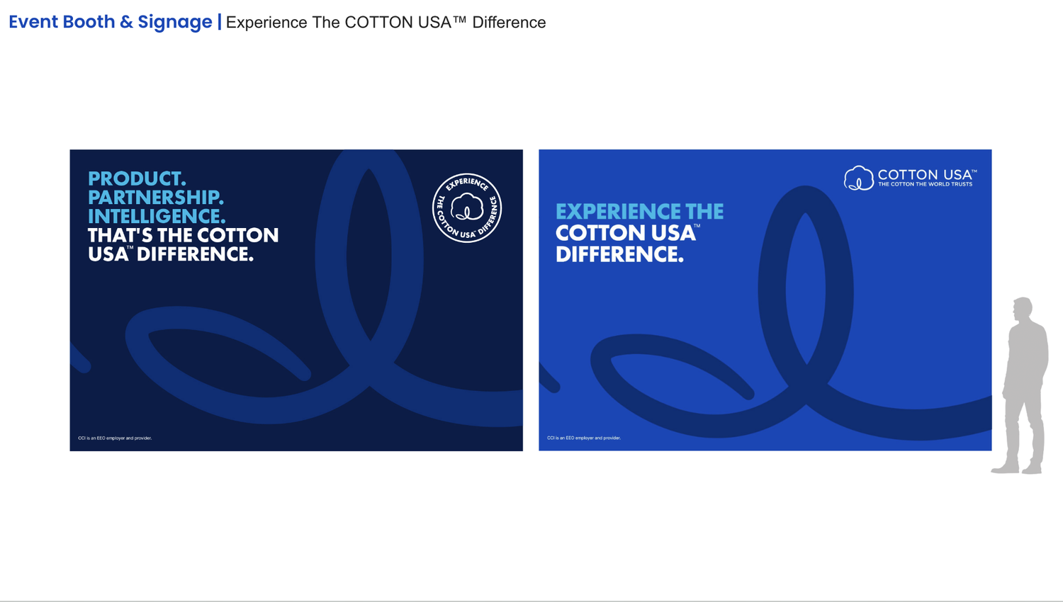
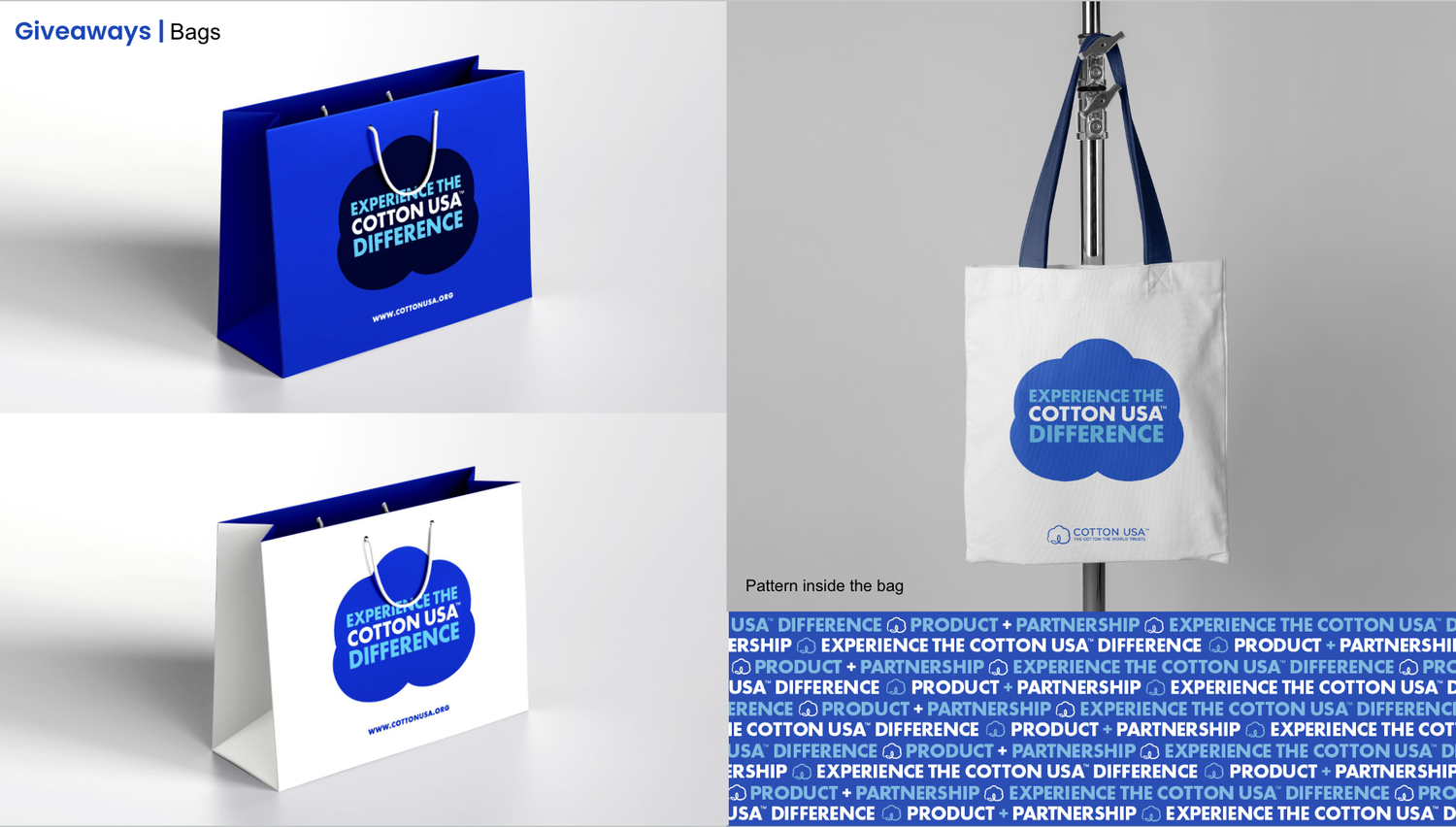
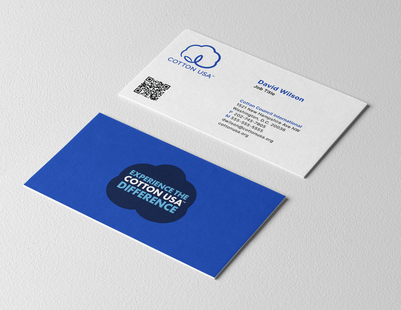
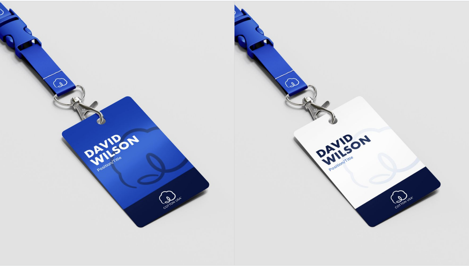
The system was applied across print ads, cell sheets, style guides, and a refreshed website, along with trade show concepts including booths, signage, environmental graphics, and branded merchandise.